Introduction
This dataset comes from the daily measures of sensors in an urban wastewater treatment plant. The aim is to classify the operational state of the plant using clustering techniques in order to predict faults through the state variables of the plant at each of the stages of the treatment process. The original authors stated this as an ill-structured domain.
The data, problem aim and backup information is available from UCI Machine Learning Repository.[^9]
I will tackle this using Python and scikit-learn. All the code can data can be cloned from from GitHub. I don’t cover much of the code here, but have covered on other posts.
Hint from the Field. $1 of spending on water and sewer investment returns $2.03 in revenue. (21st Century Infrastructure Report, prepared for Governor Rick Snyder, November 30, 2016, p. 12, https://www.michigan.gov/documents/snyder/21st_Century_Infrastructure_Commission_Final_Report_1_544276_7.pdf) (accessed Nov. 2020)
Clustering
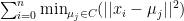
Clustering refers to a set of algorithms set out to find subgroups or clusters in a data set. The aim is to partition the data into distinct groups so that the observations contained within a cluster are like each other and conversely those observations in other groups differ from each other.
For this exercise we have a set of $n$ observations or instances, each with $p$ features or attributes. The $n$ observations corresponds to the days (527 number of instances) of measurements taken within the plant of $p$ features (38 number of attributes). The goal is to use the measurements taken from the sensors and try to group the observations on operational states of the plant in order to predict faults. We can use the results from this unsupervised method as a basis for future works with additional information in a supervised learning algorithm.
Clustering can utilise many methods, including K-Means, Affinity propagation, Mean-shift, Spectral clustering, Ward hierarchical clustering, Agglomerative clustering, DBSCAN, OPTICS, Gaussian mixtures, Birch to name a few. For this problem we will use two common known methods – the K-Means and Agglomerative clustering.
K-means clustering
The K-means algorithm aims to choose centroids that minimise the inertia, or within-cluster sum-of-squares criterion:
Hierarchical Agglomerative clustering
A dendrogram can represent bottom-up or agglomerative clustering. A dendrogram is a diagram depicting a tree. We build the dendrogram, starting from the leaves and combining clusters up to the trunk (hence depicted as an inverted tree). This method scales well with many instances or clusters. It can capture clusters of various sizes and shapes. We can use it with many pair-wise distances including Euclidean, Manhattan, Cosine or Precomputed.
Wastewater Sources and Flow Rates
The overall aim of wastewater treatment is to remove enough solid and dissolved organic material that the wastewater is safe for discharge to the intended receiving water or other media (that can be rivers, streams, ponds, lakes, oceans, or groundwater – or overland). Treated water is not intended as potable or even swimmable or fishable water, except in very rare cases. – Hopcroft[^7]
Table 3.1 Comparative composition of raw wastewater[^7]
| Constituent | Low strength | Medium strength | High strength |
|---|---|---|---|
| 5-day Biochemical Oxygen demand (BOD 5, ), mg/L | 100-200 | 190-220 | 350-400 |
| Chemical Oxygen Demand (COD), mg/L | 240-260 | 430-500 | 800-1000 |
| Total solids, mg/L | 300-400 | 700-800 | 1200-1250 |
| Total suspended solids (TSS), mg/L | 100-120 | 210-220 | 350-400 |
| Volatile suspended solids as a % of TSS | 75-81% | 75-81% | 75-81% |
Table 3.2 EPA discharge limits for wastewater treatment plants (40 CFR 133.102)[^7]
| Time | Total $BOD_5$ | Suspended solids |
|---|---|---|
| Monthly average | 30 mg/L and >85% removal | 30 mg/L or 85% removal |
| Weekly average | 45 mg/L | 45 mg/L |
Appendix 6: Typical effluent quality following various levels of treatment – NWQMS[^8]
| Treatment | BOD mg/l | TSS mg/l |
|---|---|---|
| Raw wastewater | 150-500 | 150-450 |
| A – Pre | 140-350 | 140-350 |
| B – Primary | 120-250 | 80-200 |
| C – Secondary | 20-30 | 25-40 |
| D – Nutrient removal | 5-20 | 5-20 |
Treatment Process
Wastewater treatment involves various processes used inline or in series to get the required effluent quality. In normal sequence, the principal processes are:
- pre-treatment which removes gross solids, coarse suspended and floating matter
- primary treatment which removes settleable solids, by sedimentation
- secondary treatment which removes most of the remaining contaminants including fine suspended solids, colloidal and dissolved organic matter by biological aerobic processes or chemical treatment (where chemical treatment produces an effluent of similar quality to that achieved by biological processes)
- nutrient removal which further reduces the levels of nitrogen and phosphorus following secondary treatment
- disinfection of effluent, which reduces pathogens to levels acceptable for the reuse or discharge of the treated wastewater
- advanced wastewater treatment which further improves the quality of effluent by processes such as sand filtration, ion exchange and microfiltration.
Primary treatment is the first process in the wastewater treatment plant to remove a significant fraction of organic particulate matter (suspended solids). These suspended solids contribute to biochemical oxygen demand (BOD5) of the wastewater. Thus, removing suspended solids also reduces BOD5. The process is important because the reduction of suspended solids and $BOD_5$:
- lowers the oxygen demand,
- decreases the rate of energy consumption, and
- reduces operational problems with downstream biological treatment processes.
Primary treatment also serves the important function of removing scum and inert particulate matter that the grit chamber did not remove. The scum comprises grease, oil, plastic, leaves, rags, hair, and other floatable material.[^2]
Secondary treatment may include the first three treatments in series or combined in varying configurations. Secondary treatment is a prerequisite for advanced wastewater treatment and disinfection. Advanced wastewater treatment discharges to sensitive environmental areas or for effluent reuse, where health consideration are paramount. NWQMS[^8]
For info on subsequent treatments, peruse the reference material at the end of the post.
Machine Learning
Frame the Problem
The data set description provided a class distribution of 13 classes induced by the original donor conceptual clustering algorithm. The author’s classification was defined in chronological order with the same operational state but just over different days, hence I considered days with the same operational state as a cluster. Based on this, I could assign the classification from a minimum of 3 clusters up to the 13.
The original class distribution was:
- Class 1: Normal situation (275 days)
- Class 2: Secondary settler problems-1 (1 day)
- Class 3: Secondary settler problems-2 (1 day)
- Class 4: Secondary settler problems-3 (1 day)
- Class 5: Normal situation with performance over the mean (115 days)
- Class 6: Solids overload-1 (3 days)
- Class 7: Secondary settler problems-4 (1 day)
- Class 8: Storm-1 (1 day)
- Class 9: Normal situation with low influent (69 days)
- Class 10: Storm-2 (1 day)
- Class 11: Normal situation (53 days)
- Class 12: Storm-3 (1 day)
- Class 13: Solids overload-2 (1 day)
I would consider combining these classes to a minimum of 3 distinct classes:
- Class 1A – Normal situation
- Class 2A – Normal situation with performance over the mean
- Class 3A – Normal situation with low influent
Hence, I would look for an optimum cluster number from somewhere between 3 to 13. If the algorithm provided something out of this range, I would need to rethink the chosen methods for this data set.
Get the Data
The data, problem objective and backup information is available from UCI Machine Learning Repository.[^9]
I created a folder structure inline with the Cookiecutter Data Science – A logical, reasonably standardised, but flexible project structure for doing and sharing data science work.
To set up a new project, cookiecutter installation is a prerequisite. Install by running the following command and navigate through the prompts:
# install prerequisite python package cookiecutter
python -m pip install cookiecutter

# start a new project
cookiecutter https://github.com/drivendata/cookiecutter-data-science
Explore the Data
The following are a list of attributes provided in the data set. I keep this handy as I found referencing just the number keep things simple.
The data set didn’t give any unit values. Hence, assumptions by the user are required on this front.
| N | Attrib. | Description |
|---|---|---|
| 1 | Q-E | input flow to plant |
| 2 | ZN-E | input Zinc to plant |
| 3 | PH-E | input pH to plant |
| 4 | DBO-E | input Biological demand of oxygen to plant |
| 5 | DQO-E | input chemical demand of oxygen to plant |
| 6 | SS-E | input suspended solids to plant |
| 7 | SSV-E | input volatile suspended solids to plant |
| 8 | SED-E | input sediments to plant |
| 9 | COND-E | input conductivity to plant |
| 10 | PH-P | input pH to primary settler |
| 11 | DBO-P | input Biological demand of oxygen to primary settler |
| 12 | SS-P | input suspended solids to primary settler |
| 13 | SSV-P | input volatile suspended solids to primary settler |
| 14 | SED-P | input sediments to primary settler |
| 15 | COND-P | input conductivity to primary settler |
| 16 | PH-D | input pH to secondary settler |
| 17 | DBO-D | input Biological demand of oxygen to secondary settler |
| 18 | DQO-D | input chemical demand of oxygen to secondary settler |
| 19 | SS-D | input suspended solids to secondary settler |
| 20 | SSV-D | input volatile suspended solids to secondary settler |
| 21 | SED-D | input sediments to secondary settler |
| 22 | COND-D | input conductivity to secondary settler |
| 23 | PH-S | output pH |
| 24 | DBO-S | output Biological demand of oxygen |
| 25 | DQO-S | output chemical demand of oxygen |
| 26 | SS-S | output suspended solids |
| 27 | SSV-S | output volatile suspended solids |
| 28 | SED-S | output sediments |
| 29 | COND-S | output conductivity |
| 30 | RD-DBO-P | performance input Biological demand of oxygen in primary settler |
| 31 | RD-SS-P | performance input suspended solids to primary settler |
| 32 | RD-SED-P | performance input sediments to primary settler |
| 33 | RD-DBO-S | performance input Biological demand of oxygen to secondary settler |
| 34 | RD-DQO-S | performance input chemical demand of oxygen to secondary settler |
| 35 | RD-DBO-G | global performance input Biological demand of oxygen |
| 36 | RD-DQO-G | global performance input chemical demand of oxygen |
| 37 | RD-SS-G | global performance input suspended solids |
| 38 | RD-SED-G | global performance input sediments |
To help me better understand how these sensor measurements related to the plant, I sketched out a typical plant and marked up the values to help me visualise any relationships between the attributes.

First pass observations:
- 2 Zn-E stated only at the input to the plant
- pH values didn’t change from input to output
- 4 DBO-E was lower than 11 DBO-P which I expected DBO to decrease going through the plant
- SS and COND stayed consistent from input to output
Correlations between attributes
A heat map of the data set can offer an easy to visualise representation of the potential correlations (strong/weak) between the attributes.

Features
Reading along the x-axis, scan up to see what is strong (red) or weak (blue) correlations to that current attribute.
Will use these correlations as a basis to drop unnecessary attributes.
1 Q-E has minimal correlation to all the others. But this is the key feature of the plant.
2 ZN-E has minimal correlations. Since they only reported Zn at the input, I will drop it.
3 PH-E has a high correlation with 10 PH-P, 16 PH-D and 23 PH-S. The PH doesn’t change much from the influent to the effluent.
9 COND-E has a high correlation with 15 COND-P, 22 COND-D and 29 COND-S. The conductivity is remains similar throughout the plant.
Prepare the Data
Pull in the raw data using Pandas. Run a few data checks. For this exercise, I didn’t want to arbitrarily remove any outliers, so I kept them. This might be something to fine-tune at a later stage, if warranted.
Data Cleaning
Missing values are key to determine a plan of attack. Most of the attributes have some missing data, as expected. The key attribute driving this plant would be the input flow rate. Since this value is large and the main process stream, I dropped the daily observation of any flow that was missing.
# Drop any nulls in the plant inflows columns.
dataset.dropna(axis=0, how='any', subset=[1], inplace=True)
For all the remaining sensors measurements, a replacement with the mean should be an acceptable first pass.
Feature Selection
I will drop ZN-E, PH and COND as discussed earlier in the correlations section.
In addition, the performance attributes, ($A_0, A_1, A_2, …$) I dropped as they are just the mathematical relationship between its attribute at each stage in the plant. For example using the following equation:


and plugging in mean values from the data set as an example:
Feature Engineering
The following are some examples of feature engineering I think this may be worth considering at a later stage:
- decomposing the day – required if you analysed additional information for example seasons, or temperatures, as the plot evinces some cyclic behaviour in the flow rates.
- transformation of features – One might consider this on the flow rate value given the large scale compared to the other attribute values
- discretizing continuous features
- aggregation of features – SSV and SS might be candidates.
Feature Scaling
Given the large disparity between the input flow values and the other attribute values, scaling of the data is appropriate to ensure the algorithms don’t apply greater emphasis on it because of the units factor.
In addition, it is good practice to use feature scaling on clustering techniques as it may constrict stretched clusters and improve performance. Scaling will not guarantee that the clusters will be spherical, but should improve it.
Short-listing and Fine-Tuning Models
My short-listing for this exercise was the two common techniques of clustering (K-means and Hierarchical).
Fine tuning the hyper-parameters at this stage wasn’t consider given the sample size, but it is something worth doing given more data or subsequent analysis.
Results
Find the Optimum Number of Clusters
K-means clustering
Using the so-called Elbow Method. Best shown via a chart of the number of clusters versus the inertial. It usually falls abruptly at the start and then the drop in inertia is smaller and this kink or elbow defines as the optimum number of clusters.
The figure shows the optimum number of clusters is 3.

Is some cases this elbow is well pronounced and in our case it isn’t, so another check would be to plot the silhouette scores to find the peak representing the optimum number of clusters.
The Silhouette Score Method also peaks at 3 clusters.

Another option is to plot a silhouette analysis plot of varies clusters. This plot shows the distribution (height) and score (wider is better) of each cluster. The dashed vertical line represents the silhouette score. Therefore, the aim of the chart is:
- to ensure all clusters extend to the right beyond the score
- vertical line is furthest to the right (score)
- height of each cluster is similar for consistent distribution.
Plot k = 3 and 5 satisfy the objectives but where k=3, it has the highest score therefore further confirmation that the optimum number of clusters is 3.

Hierachical Agglomerative clustering
The dendrogram is a bottom-up design which starts at the bottom and assigns 1 cluster per observation. Each cluster contains a horizontal line connecting the closest pair at a distance represented by the pairs vertical lines. This continues upward until it reaches 1 final cluster encompassing all the observations.
Now to find the optimum number of clusters from the dendrogram, locate the largest height of a vertical line measured between any horizontal line drawn across completely from one side to the other.
Based on this the largest vertical height occurs between the 40 and ~ 45 Euclidean distance horizontal lines. Hence if you were to draw a horizontal line just above the 40, it would bisect 3 vertical lines which is the optimum number of clusters.

Train the Model and Prediction
Using the optimum number of clusters of 3, we can train the model using K-Means and Agglomerative Clustering.
# Training the K-Means model on the dataset

# Review the elbow plot, Silhouette plots, and Dendrogram and set the number of clusters.
n_clusters = 3

kmeans = KMeans(n_clusters= n_clusters, init= 'k-means++', random_state=0).fit(X)
y_kmeans = kmeans.fit_predict(X)

# Training the Hierarchical Clustering model on the dataset
from sklearn.cluster import AgglomerativeClustering
hc = AgglomerativeClustering(n_clusters = n_clusters, affinity = 'euclidean', linkage = 'ward')
y_hc = hc.fit_predict(X)
Prediction Remapping
As the cluster prediction index values assigned are random, I remapped the K-Means and Agglomerative predictions with indexes 1, 2, 3 representing the lowest number of observations in a cluster (index 1) to the highest number of observations (index 3).
I did this to aid in comparing and the visualising the resulting graphs, keeping in mind reading from left to right (1 to 3) that 1 is the lowest number of observations up the highest number.
Predicted Clusters versus attributes
As both K-means and Agglomerative provided the same number of optimum clusters, I will only show the results from one method here (K-means). I show both charts in the notebook at GitHub.
The distribution of observations to clusters for K-means was 2, 244, 263, and for Agglomerative was 2, 199, 308. Since the smallest cluster only contains 2 observations, they will not provide much variation and the box plots will show as a flat line, or a collapsed box.
Scatter Plot
This scatter plot is for illustrative purposes only as the plot is only showing 2 dimensions (x and y) and our dataset has 20+ dimensions, which cannot translate correctly onto a 2D plot. So we can take not much from this plot regarding overall cluster formation.

Box Plots
Input flow
The average input flow rate (Q-E) hovers around the 40k mark (units unknown). Cluster 3 has a tighter spread than cluster 2.

Suspended Solids (SS)
The aim of primary sedimentation is to remove 50-70% of the suspended solids. The effluent suspended solids should be below 30 mg/L per EPA 40 CFR 133.102.

The input suspended solids (SS-P) into the primary settler is just over 200 mg/L. Cluster 3 has a few outliers with one upward of 2000 mg/L.
Note: The SS-D, and SS-D y-axis updated to show the refined range, due to the couple of large outliers at SS-P.
Cluster 1 SS-S effluent remained unchanged from the Influent SS-P around 175 mg/L. This could suggest some overflow or plant down condition. Or it could be a sensor error because of the minimal number of observations. Clusters 2 and 3 effluent SS-S remained below 25 mg/L.
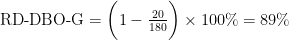
The bottom row of the chart shows the performance values, which is a direct relation to its values at any point as shown in equation 1.
- All clusters performed as expected at the primary settler setter of around 60%.
- For the effluent SS-G, cluster 1 performed poorly at 30%, while clusters 2 and 3 preformed well at 90%.
The data set didn’t provide the performance of the suspended solids after the secondary settler but we can approximate it with equation 1 above as:

Biological Oxygen Demand (BOD / DBO)
The aim of primary settler is to remove approximately 25-40% of the BOD. The effluent BOD should be below 30 mg/L per EPA 40 CFR 133.102.
All clusters BOD (DBO-E) input is around 200 mg/L. The BOD drops across the settlers and the effluent DBO-S remains unchanged for cluster 1 as discussed above, but clusters 2 and 3 leave at < 25 mg/L and a performance or reduction of 90%.

Chemical Oxygen Demand (COD / DQE)
Influent COD (DQO-E) ranges around 400 mg/L for the clusters. Effluent DQO-S reduced to 100 mg/L except for cluster 1 as discussed.
Performance for DQO-E at the primary settler wasn’t provided in the data set, but we can calculate the average with equation 1, at 38%.

Effluent DQO-G reduction of 80% for clusters 1 and 2. Effluent DQO-G reduction of 80% for clusters 1 and 2.

Sediment (SED)
Most of the sediment reduced during primary settling at 90% performance. Secondary settlers all but removed effluent SED for Clusters 2 and 3 with 99% performance.
Note: The SED-D, and SED-s y-axis updated to show the refined range, due to the couple of outliers at SED-P.
Once again, we can determine the average SED performance at the secondary settler from equation 1:


Closing and Next Step
This exercise shows how to cluster in a real world operating plant.
It is a start, and the charts may provide some useful information for a trained operator.
Additional info of actual faults would help extend this pipeline to supervised learning of actual faults to refine an overall online model that may predict potential faults in advance to allow time for the operators to plan maintenance or repair to keep the plant running at its plated capacity.
Additional readings links.[^1],[^3], [^4], [^5], [^6]
References
[^1]: Cheremisinoff, Nicholas P.. (1996). Biotechnology for Waste and Wastewater Treatment. William Andrew Publishing/Noyes. Retrieved from AIChE Knovel
[^2]: Mackenzie L. Davis, Ph.D., P.E., BCEE (2020). Water and Wastewater Engineering: Design Principles and Practice, Second Edition (McGraw-Hill Education). AccessEngineering
[^3]: Soli J Arceivala; Dr. Shyam R. Asolekar. Wastewater Treatment for Pollution Control and Reuse, Third Edition. Guidelines for Planning and Designing Treatment Plants and CETPs, Chapter (McGraw Hill Education (India) Private Limited, 2007). AccessEngineering
[^4]: S D Khepar, M E (Roorkee); A M Michael; S K Sondhi). Water Wells and Pumps, Second Edition McGraw Hill Education. https://www.accessengineeringlibrary.com/content/book/9780070657069
[^5]: Nalco Water, an Ecolab Company. Nalco Water Handbook, Fourth Edition (McGraw-Hill Education: 2018). https://www.accessengineeringlibrary.com/content/book/9781259860973
[^6]: Indranil Goswami, Ph.D., P.E. Civil Engineering All-In-One PE Exam Guide: Breadth and Depth, Third Edition. (McGraw-Hill Education: 2015). https://www.accessengineeringlibrary.com/content/book/9780071821957
[^7]: Hopcroft, Francis. Wastewater Treatment Concepts and Practices, Momentum Press, 2014. ProQuest Ebook Central, http://ebookcentral.proquest.com/lib/slq/detail.action?docID=1816350.
[^8]: NWQMS National Water Quality Management Strategy. Australian Guidelines for Sewage Systems – Effluent Management, 1997.
[^9]: Dua, D. and Graff, C. (2019). UCI Machine Learning Repository http://archive.ics.uci.edu/ml. Irvine, CA: University of California, School of Information and Computer Science. Dataset link https://archive.ics.uci.edu/ml/datasets/water+treatment+plant